

Checked September 22, 2026. CapCut changes its menus and feature availability across desktop, web, mobile, app versions and accounts. The paths below describe the current official guidance; use the equivalent Adjustment or Adjust controls if your layout differs.
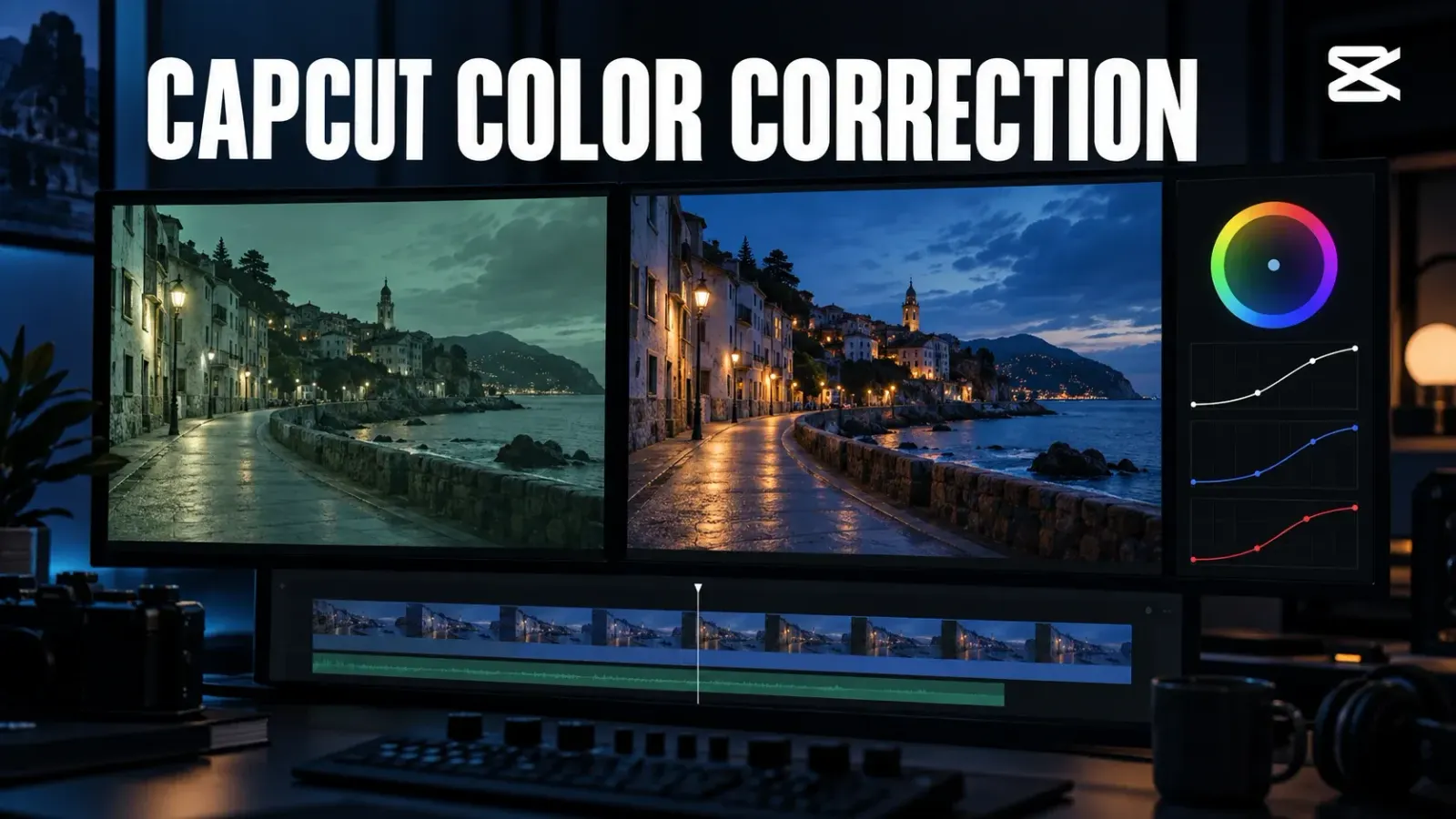
A good CapCut color correction is less about making one frame dramatic and more about making the whole edit believable. Fix brightness first, remove an unwanted color cast, check skin and saturation, then compare neighboring clips. Save filters, LUTs and a stylized grade for after the footage looks consistent.
For a quick start, select the video clip in CapCut Desktop and open Adjustment; on the web, find Basic → Color adjustment; on mobile, select the clip and open Adjust. Those are the routes in CapCut’s current color-grading guide. Begin with small changes, compare against the original, and watch the shot in motion before exporting. This is an editorial order of decisions, not a claim that CapCut requires a particular slider sequence.
Find the right controls for your editor
| Platform | Where to begin | Practical note |
|---|---|---|
| Desktop | Put the video on the timeline, select it, and open Adjustment. | Work on the selected shot, then inspect the next shot before copying a look. |
| Web | Select the video and open Basic → Color adjustment. | The web layout and available advanced controls can differ from desktop. |
| Mobile | Select a clip and tap Adjust. | CapCut describes Apply all for sharing an adjustment across clips; check each result afterward. |
CapCut’s video color correction overview documents basic adjustments alongside more targeted tools such as HSL, color wheels and curves. You do not need to begin with the advanced controls. If you cannot find an option mentioned in an older tutorial, check the platform, selected clip, app build and account before assuming the feature has disappeared. Our CapCut tutorial hub covers the wider editing workflow.
The correction order that keeps you out of trouble
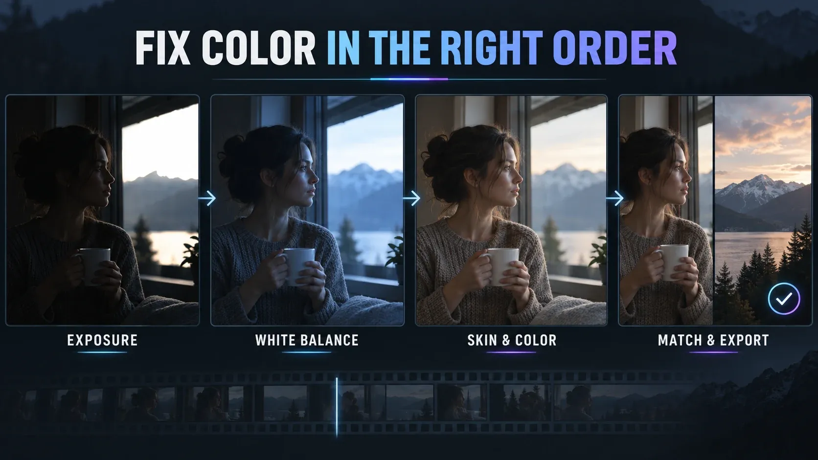
1. Make the subject readable without flattening the scene
Choose a representative frame, preferably one with the subject and a bright area visible at the same time. If the face is too dark, lift the overall exposure or darker tones cautiously. If a window or sky is distracting, reduce the brightest tones where useful. Avoid pushing contrast until you can see what the exposure adjustment has done: added contrast can bury a face or make a bright area look harsher.
The stopping point is a readable subject with believable light, not a histogram that looks perfect. If a source region is pure white or black with no recorded detail, a slider cannot recreate what the camera never captured. Do not promise a blown-out window will recover because it looks dimmer in the preview.
2. Correct an unwanted color cast
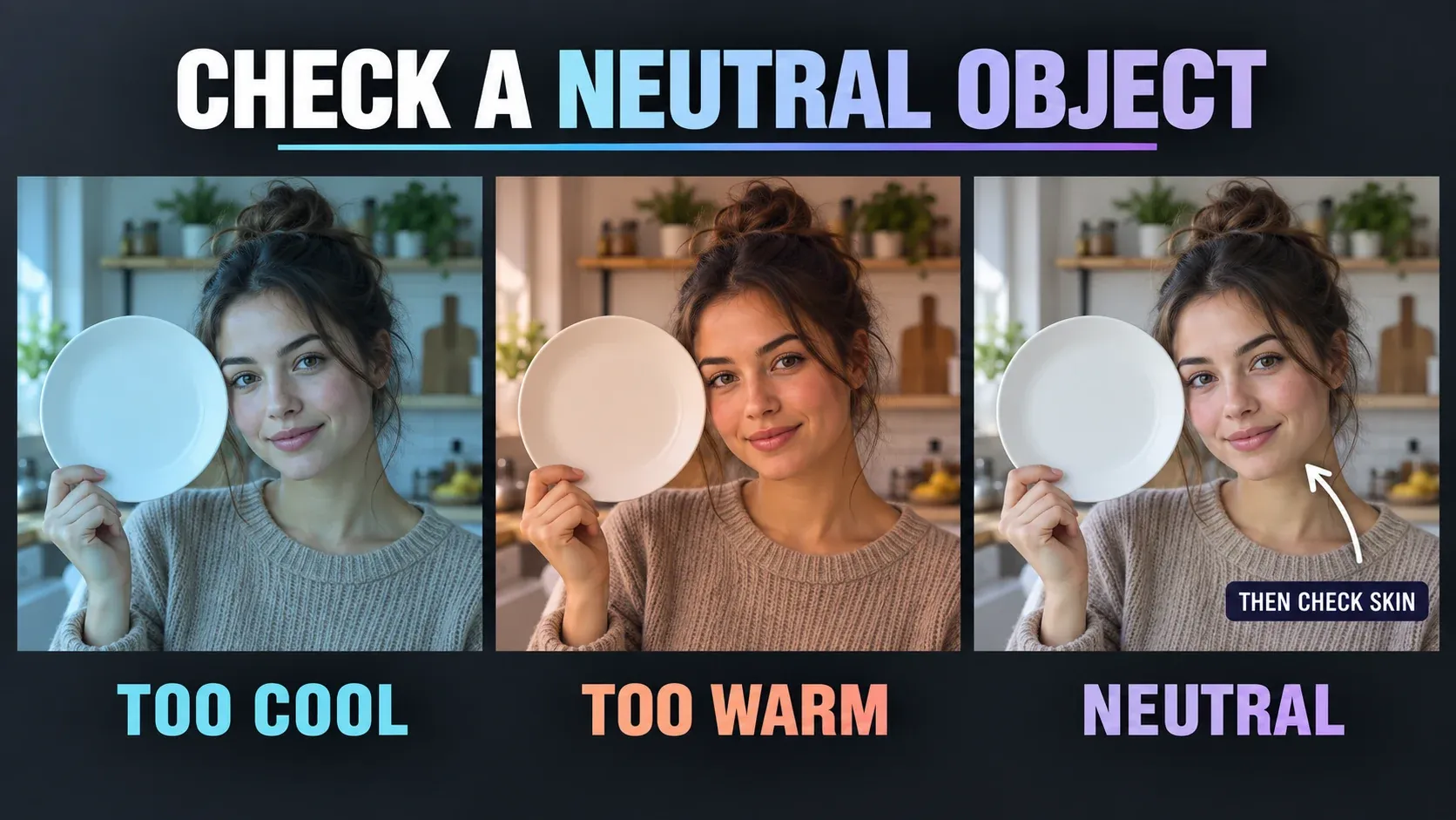
Look for something that should be approximately neutral: a white mug, gray fabric or an uncolored wall. If it looks blue under ordinary neutral light, nudge temperature warmer; if it looks orange, nudge cooler. If a pale surface looks green or magenta, adjust tint carefully. The College of Wooster’s CapCut quick tip describes temperature, tint, saturation and contrast as distinct adjustments, and recommends subtle changes.
A white object is a reference, not a command to erase the scene’s lighting. A sunset, colored stage light or warm lamp should still feel warm after correction. Use the neutral reference to spot an accidental cast, then ask whether changing it would destroy the atmosphere.
3. Check skin and keep saturation under control
After the neutrals look sensible, look at faces. Too much saturation can make skin orange or red even if a white mug looks right. Too little can leave a face gray. Make a small saturation change, then switch back to the unadjusted version to catch an edit that merely looks more colorful.
If the overall scene is good but one color is distracting, HSL can target a color range more precisely; CapCut documents HSL, wheels and curves in its desktop adjustment guidance. Use those controls for a specific problem, not because every clip needs an elaborate grade. The color of a subject’s clothing, wall or practical light can legitimately differ from a neighbor’s, so do not force every color to match.
4. Compare shots before applying a shared look
Pick one shot with a natural-looking subject as your reference. Pause on a similar part of the next shot, then compare overall brightness, the same neutral surface if visible, and skin. First correct the second shot’s own exposure and cast. Only then use copied adjustments or a shared look as a starting point.
CapCut’s mobile guide describes Apply all as a way to apply adjustments across clips. That copies settings; it does not measure and correct the different lighting in each source shot. This is why identical slider values may leave one shot warm and another cool. Recheck every shot that received the adjustment, especially clips filmed indoors versus outdoors.
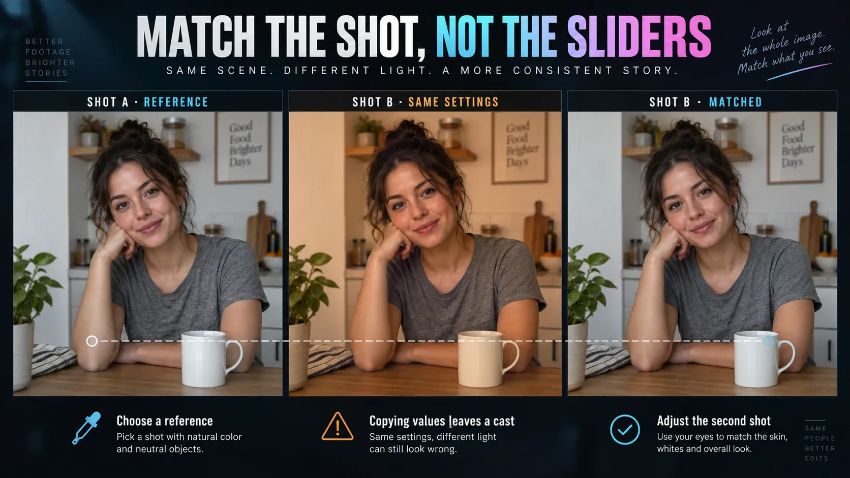
A match does not mean identical pixels. A close-up and a wide shot can have different backgrounds and contrast. The point is to avoid an unintentional jump in brightness or skin color when the cut plays at normal speed. If a color cast changes during one shot, inspect several moments rather than trusting one paused frame.
Correction, filter or creative grade?
Correction solves an observable problem: an underexposed subject, unwanted blue cast or mismatched shots. A filter or LUT gives footage a chosen style. The distinction matters because a preset applied to poorly matched sources can exaggerate the mismatch. CapCut presents adjustment tools and filters as separate ways to change a video’s color in its official correction overview.
Once the neutral version works, add a look sparingly. If it changes the face more than the story needs, reduce the effect or return to manual adjustments. For creative looks, see our CapCut effects guide. Keep the underlying correction and the optional style as separate decisions so you can tell what fixed the footage and what simply changed its mood.
If the result still looks wrong
| Symptom | Check first | Next move |
|---|---|---|
| Face remains dark while the window is bright | Is the source exposing for the background? | Lift the subject carefully; accept that a single global change may not save both extremes. |
| White objects are blue or orange | Is the light intentionally colored? | Adjust temperature only for an unwanted cast; preserve sunset or lamp warmth. |
| Skin looks orange but the room looks fine | Was saturation pushed too far? | Reduce saturation; use a targeted color adjustment only if the issue is isolated. |
| Shots jump in color at every cut | Were the same values copied to clips with different light? | Correct each source against a reference shot, then watch the sequence. |
| Preview looks good but the delivered video does not | Are you judging the local export or a compressed upload? | Open the exported file, compare the same frame and check export settings before blaming the grade. |
Auto correction can be a first comparison, not a finish line. Keep it only if faces, neutral objects and transitions improve together. Stronger is not necessarily better; a restrained edit that remains stable across the cut is more useful than one striking still frame.
Check the exported video, not just the timeline
Play the finished file outside CapCut and pause on the frames you used for the edit. Compare the neutral reference, skin and the cut between two shots. If the local file differs from the editor preview, check the actual export resolution, frame rate, codec and bitrate options. CapCut’s current color-grading guide includes export as the final step; our CapCut export settings guide explains those controls in detail.
If the local file looks right but a platform upload looks different, keep those as separate observations. Repeated compression, player behavior and display differences can complicate the comparison. Our CapCut export quality guide helps troubleshoot the delivery chain. This article is about correction within the edit, so do not try to solve a platform-specific display problem by blindly shifting every color slider.
My recommendation: save a natural baseline first, match the shots in the order viewers will see them, and make the export earn its place by checking the file. That gives you a reliable edit before any cinematic look is layered on top.
Frequently asked questions
What is the easiest way to color correct in CapCut?
Select the clip, open Adjustment on desktop or Adjust on mobile, then fix exposure and an unwanted color cast before changing saturation. Compare with the original and with the next shot. The current web guide uses Basic → Color adjustment.
Does Apply all match the colors of different clips?
It applies the same adjustments. Clips recorded under different light may still look different, so compare each shot and correct its source-specific exposure and cast.
Should I use a filter before color correction?
Usually correct obvious exposure and white-balance problems first. Then decide whether a filter adds the mood you want. A filter can make a mismatched pair of clips more visibly inconsistent.
Why does my video look washed out after export?
First compare the local exported file with the editor preview, then compare the local file with the uploaded version. Do not assume a stronger saturation setting is the answer. Follow the HDR and SDR export diagnosis before changing a grade that was already right in the editor.