


Select your video clip, open Adjustment in the right panel and choose Curves. Add a point to the curve and move it gently while watching the image. CapCut’s Desktop editing instructions document this selected-clip route, and the graph lets you work on specific parts of the tonal range.
A curve is useful when a broad contrast slider moves too much of the picture. You might want deeper dark tones while a face stays readable, or softer bright areas without dulling the whole shot. A curve still affects every image area with the relevant tone, so it isn’t an object-selection tool.
I’d start with a balanced shot and one clear aim. If you can’t say what needs to change, leave the curve straight while you assess the image.
Read the graph before moving a point
On the standard RGB curve graph, the horizontal axis runs from darker input tones on the left to brighter ones on the right. The vertical axis shows the adjusted output: higher is brighter, lower is darker. Adobe’s curve overview explains this input-to-output relationship. The principle helps you read a curve. The Photoshop menus and shortcuts in that overview are separate from CapCut’s controls.
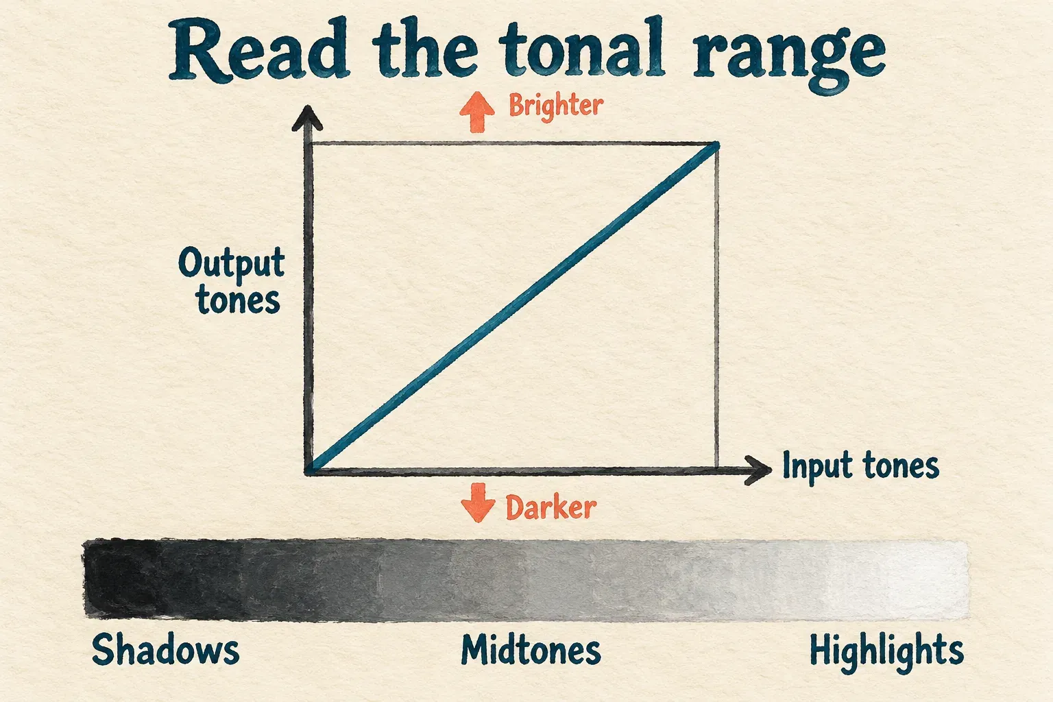
The straight diagonal is an unchanged mapping for that curve. That doesn’t mean the clip is unedited: basic corrections, filters or other treatments may already be active.
- Left portion: darker tones and shadow detail.
- Middle portion: midtones, often important for the subject’s visible form.
- Right portion: brighter tones and highlights.
Move a point above the starting diagonal and the corresponding tones brighten. Move it below and they darken. The curve bends around the point, so nearby tones can shift too. A point isn’t a hard boundary around a patch of the image.
A steep section pulls nearby input tones further apart. A flatter section squeezes them closer together. That’s why a dramatic curve can make detail look harsh in one area and compressed in another. Shape the image you need instead of chasing a particular curve silhouette.
Make a small contrast change on the overall curve
Start with whatever overall-brightness curve your panel offers. CapCut’s color-grading overview describes RGB and Luma curves for brightness, contrast and color-channel adjustments. If your panel calls the overall control Luma, begin there for this exercise, and make sure you don’t pick Red, Green or Blue by mistake.
The basic point-editing method is described in CreateThat’s CapCut curve guide. That older walkthrough is useful for the graph, although your current labels or layout may differ.
- Select the video clip and open Adjustment → Curves.
- Choose the overall-brightness curve shown in your build.
- Click the line in the darker-tones region to add a point, then move it a little downward if those tones need more depth.
- Add a point farther right and move it a little upward if the brighter tones need more separation.
- Compare with the starting curve and inspect the subject before deciding whether both changes help.
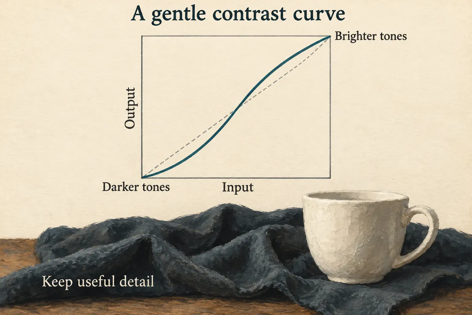
This is a common contrast approach, not a mandatory cinematic recipe. On footage that’s already contrasty, the same direction can make the shot worse. A smaller move, a change to just one tonal region or keeping the original curve may be the better call.
Keep an eye on a dark sleeve or textured wall as you deepen shadows, and on bright clothing or a window as you lift highlights. If those areas turn featureless and the original has detail, ease the curve back.
For an overall exposure or lighting-cast problem, the color-correction guide is a better starting point. Get that foundation right before you add a strong creative curve.
Separate brightness shaping from RGB color changes
Each Red, Green or Blue curve changes how much that channel contributes across the tonal range. Raise blue in a region and those tones can turn bluer relative to red and green. Lower blue and they can shift in a warmer direction. You’re changing a channel, not selecting only the blue objects.
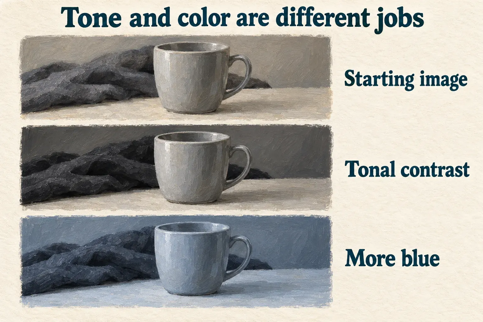
Keep something neutral in view while you adjust a channel. A cool creative shadow may suit the scene, but if a cup that should be neutral turns obviously blue, that’s a reason to reassess the choice. Check skin, too, and any product whose recognizable color matters.
Make one channel decision at a time. Several strong bends stacked together can leave a confusing result, especially when a LUT or filter is already changing the image. Look at that existing treatment before you try to undo it with three more channel curves.
HSL and curves answer different questions. HSL adjusts a hue range, such as reds or blues. A channel curve changes how much one channel contributes based on tone, including colors that contain that channel. For a simple, unwanted cast across the whole picture, temperature and tint may be easier to control than a complicated curve.
There’s no universal set of point coordinates for natural skin or an orange-and-teal look. What a curve does depends on the source light, the camera’s interpretation and earlier adjustments.
Keep the endpoints and lost detail in perspective
The bottom-left and top-right ends help set the darkest and brightest mappings. Move an endpoint and you can shift the tonal foundation of the whole image. Leave both alone at first while you learn what the interior points do.
Lifting the darkest output can create a faded-black style. That doesn’t recover texture that was never recorded. Pull dark tones down aggressively and you can hide detail that’s still in the source. Push bright tones up aggressively and you can wash out highlight texture the footage retained.
Likewise, pulling a bright region down may darken that area without revealing what’s inside a fully clipped window. A curve changes the values you have. It can’t manufacture a faithful record of scene detail that’s missing.
If a neutral contrast change suddenly adds a strong cast, check which channel you’ve selected and what other treatments are active. A posterized or unnaturally harsh picture is your cue to reduce the bend and compare it with the previous version. Don’t add more points just to make the graph look sophisticated.
To undo the curve, use the panel’s reset control where available, or undo the recent change. Confirm which adjustment that reset affects before you discard other color work. Don’t carry Photoshop point-deletion shortcuts or numeric limits over into CapCut.
Judge the curve on the shot, then on its neighbors
Play the clip through changes in light and motion. A curve that suits the opening frame may make a moving subject too dark later. Compare the brightest and darkest meaningful moments, then watch the cut to the next shot.
If you copy a grade, check the footage it lands on. Identical curves don’t make differently lit shots match. A LUT also needs the correct source interpretation and a suitable strength, and pairing one with a steep curve can amplify an already strong look.
If Curves is missing, check the selected timeline item, platform and app build. This Desktop method doesn’t establish that every Mobile or Web version has the same graph controls. Save the project before an official update, and use the supported basic tools if that’s what your panel provides.
Once you export, inspect the same tonal details in the saved file. Follow the color-space guide if the whole file looks different from the editor, and the export guide for delivery choices. I wouldn’t lean on another curve as a substitute for diagnosing an interpretation mismatch.
Keep the source media and the editable project. The tutorial hub connects the surrounding editing tasks; a good curve gives this particular shot the tonal separation it needs.