

Checked September 23, 2026. CapCut changes panel layouts across mobile, desktop and web, so this guide follows the editing logic that survives those changes: select the text layer, choose an entrance, exit or loop, then use keyframes when the motion needs more control.
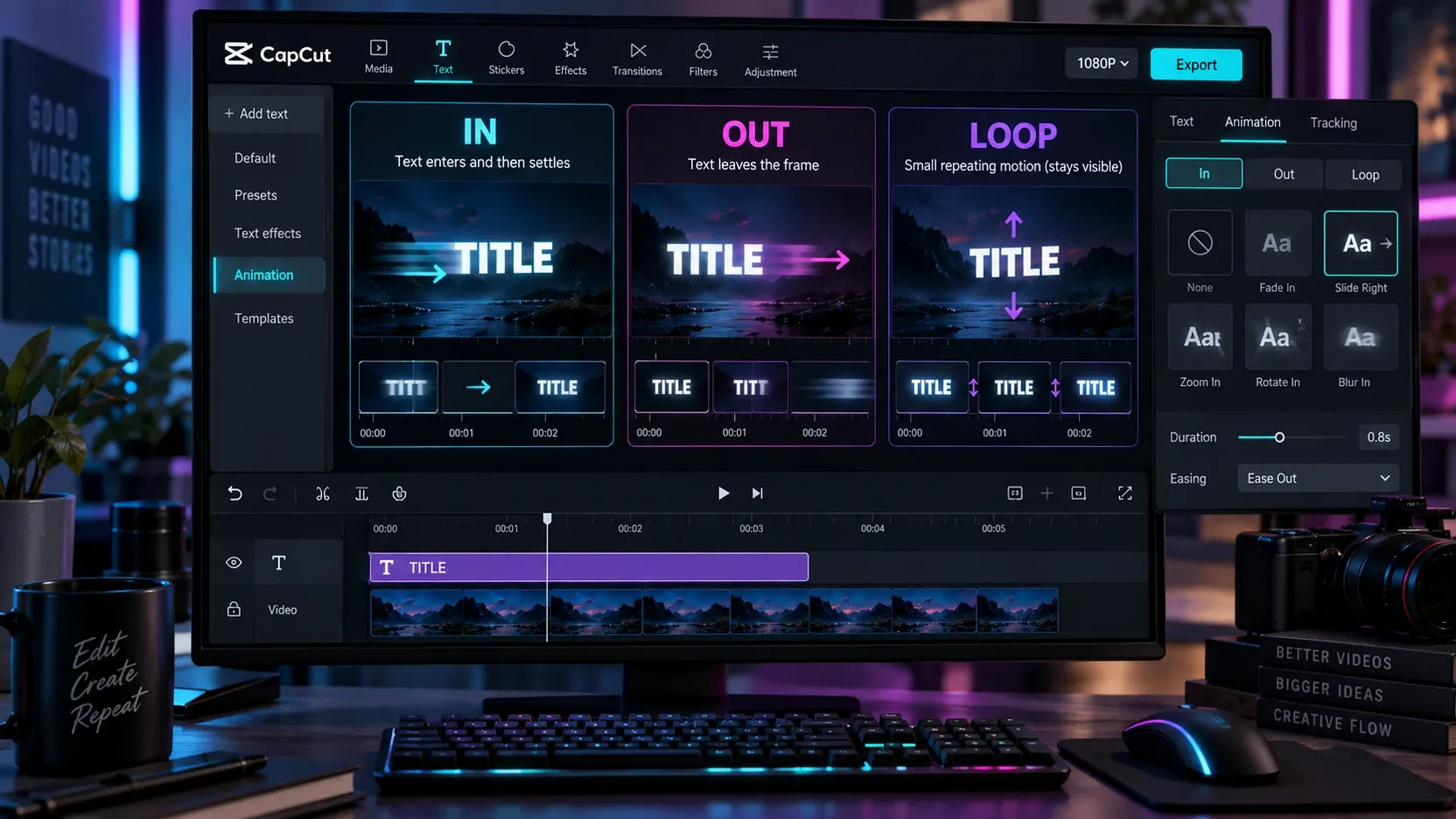
To animate text in CapCut, add or select a text layer, open Animation, and choose an In, Out or Loop preset. In controls how the text enters, Out controls how it leaves, and Loop repeats while the layer remains visible. Adjust the animation duration against the text layer, then preview the full sentence rather than judging the effect in isolation.
Use a preset when you need one clean action. Use manual Position, Scale and Opacity keyframes when the words must land on a beat, travel to a specific location, reveal in stages or repeat as a consistent motion system.
Fast rule: animate the message hierarchy, not every available property. One strong entrance plus a quiet exit is usually easier to read than a loop, bounce, rotation and color change competing at the same time.
Choose In, Out, Loop or manual keyframes
| What the text needs to do | Best starting method | Why |
|---|---|---|
| Appear once and settle | In preset | Fast, contained and easy to time |
| Leave before a cut or new title | Out preset | Clears the frame intentionally |
| Keep moving while visible | Loop preset | Useful for a small repeating accent |
| Move to an exact screen position | Position keyframes | You control the start and end framing |
| Grow, shrink or punch on a beat | Scale keyframes | The size change can match the rhythm |
| Fade independently of movement | Opacity keyframes | Appearance and movement remain separate |
| Animate words in sequence | Separate text layers plus presets or keyframes | Each word gets its own timing |
CapCut typically groups built-in text animation under In, Out and Loop. The exact names, thumbnails and location can change between versions. The job of each category is more stable than the menu layout: entrance, departure and repeating motion.
CapCut's official animated text maker describes adding an animated text template to the timeline, replacing its words, and adjusting its duration, position, size and appearance. That route is useful when speed matters. It becomes limiting when several text layers need to move as one deliberate sequence.
Animate text with a built-in preset
If the text layer already exists, the preset workflow is short:
- Select the text layer on the timeline.
- Open the current Animation controls.
- Choose In, Out or Loop according to the job.
- Preview several presets on the actual sentence.
- Adjust the animation duration without changing the text layer's total screen time.
- Play from before the layer appears until after it disappears.
- Check the result at normal playback speed and at the size viewers will see.
If you still need to create and format the layer, start with the guide to add text in CapCut. This article begins after the words, font and basic placement are already usable.
Match the preset to the meaning
A title that establishes a place can slide into a stable position. A price or result can use a brief scale punch. A quiet explanatory label may need only a fade. A loop makes sense for a decorative accent or a word that should feel active, but it can make a full sentence tiring to read.
Do not choose a preset by how impressive its preview looks. Judge what happens after the motion ends. The viewer still needs a stable moment to read the text. If the layer starts leaving as soon as it becomes legible, shorten the entrance or extend the layer.
Control preset duration separately from layer duration
The text layer determines how long the words exist in the project. The animation duration determines how much of that time is spent entering, leaving or looping. Treat them as separate decisions.
For a short title, reserve enough stable time between the In and Out animations. For a long sentence, extend the layer before slowing the entrance. If an entrance occupies most of the layer, the sentence may never reach a calm reading state.
Build custom text motion with keyframes
Manual motion starts with states, not effects. Decide where the text begins, where it ends, and which properties must change between those moments.
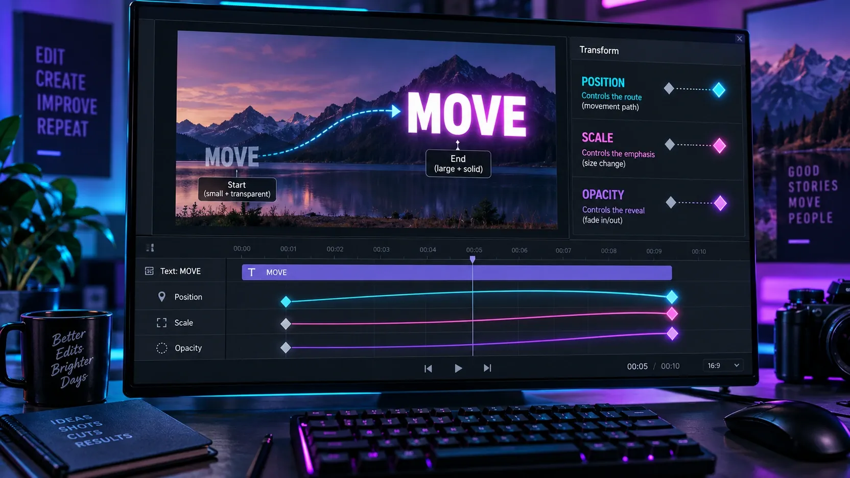
CapCut's official keyframe guide identifies Position, Scale, Rotation and Opacity as properties that can change over time. For most motion typography, Position, Scale and Opacity are enough. Rotation is useful when the composition calls for it, but adding it automatically makes text harder to keep aligned.
- Select the text layer and move the playhead to its first visible frame.
- Set the starting Position, Scale and Opacity.
- Add keyframes for the properties that will change.
- Move the playhead to the landing moment.
- Set the final Position, Scale and Opacity.
- Preview the move and change keyframe spacing to adjust speed.
- Add intermediate keyframes only when the path or rhythm requires another state.
A dependable entrance recipe
For a clean lower-third or title entrance:
- Start slightly outside the final position.
- Begin at a modestly smaller Scale rather than an extreme size.
- Start at low Opacity if the move needs a softer appearance.
- Land at the final Position, full Scale and full Opacity.
- Leave the text still long enough to read.
This creates one coherent movement. If the text travels from the left, scales from almost zero, rotates and bounces at the same time, the viewer must track too many changes before reading the words.
Make the text exit without a visible jump
Place the first exit keyframe while the text is still in its settled state. Move later on the timeline, then change Position or Opacity for the departure. If the exit begins from values that do not match the settled state, the text can jump before it moves.
A fade can clear a dense frame without pulling attention away from the next shot. A directional exit works better when the cut or camera movement continues in the same direction.
Control speed with keyframe spacing
Wider spacing gives the same property change more time and normally makes the motion feel slower. Narrower spacing makes it faster. Keep the start and end states unchanged while adjusting spacing; otherwise you are changing travel distance and duration at once.
If your build exposes easing or a motion graph, use it to soften starts and stops. Do not depend on a particular easing label being present on every platform. A slightly longer move with clear endpoints is a safer fallback than a sharp jump.
The full CapCut keyframe guide covers the wider mechanics. Here, the goal is to use the fewest properties needed for readable typography.
Create kinetic typography that stays readable
Kinetic typography gives words a visual rhythm, but the spoken line and the visible line must remain understandable. Split the phrase according to meaning before adding motion.
A useful sequence is:
- Break the sentence into two to five meaningful groups.
- Put each group on its own text layer.
- Keep font, color, stroke and shadow consistent.
- Offset the layers on the timeline according to the voice or beat.
- Give important words more motion and supporting words less.
- Leave each group visible long enough to read after it lands.
- Remove any animation that does not clarify emphasis or sequence.
Separate layers give each word or phrase independent timing. They also create more alignment work, so decide on a text system before duplicating layers.
For speech-synced highlighting rather than free-form typography, use word-by-word captions in CapCut. Captions solve transcription and reading flow; manual kinetic type is better for selected headlines, hooks and emphasized phrases.
Use hierarchy instead of constant motion
Choose one primary treatment for the most important word: a scale punch, color change or directional move. Supporting words can fade or remain static. The contrast between active and quiet text creates hierarchy.
A sentence where every word uses a different preset may look busy while communicating less. Repetition is valuable when it establishes a pattern: the same entrance direction, the same landing position and the same emphasis scale across several lines.
Time words to the sound without chasing every frame
Start with the clear accents: the first stressed word, the beat drop, a pause or the end of a phrase. Place those layers first. Fill the supporting words between them. This keeps the sequence anchored to meaningful moments instead of becoming a frame-by-frame guessing exercise.
Read the line at normal speed. If the words arrive faster than the viewer can recognize them, increase the gap between layers or keep previous words visible longer. If the line feels sluggish, shorten the settled gaps before making every entrance faster.
Build a reusable text animation style
A repeatable system is faster to edit and easier to watch than a new effect on every title.
Define these choices once:
- final text position;
- entrance direction;
- entrance duration;
- emphasis Scale;
- exit behavior;
- font, weight and casing;
- primary and accent colors;
- stroke or shadow treatment;
- safe margins from the frame edges.
Create one finished layer, duplicate it, replace the words, and adjust timing. Recheck each duplicate because a longer phrase changes width, line breaks and reading time.
For team or campaign consistency, the CapCut Brand Kit guide explains how reusable fonts, colors and assets fit into a broader visual system. Motion rules still need editorial discipline even when the static styling is stored.
Keep text inside a stable reading area
Vertical video interfaces can cover the right edge and bottom of the frame. Keep essential words away from those zones, especially when Position keyframes travel toward an edge. Preview the text at the final delivery aspect ratio rather than relying on the editor's available canvas area.
Text should remain readable over the brightest and darkest parts of the footage. A restrained shadow, stroke or backing shape can help. If the background changes sharply during the layer, split the text treatment or adjust the footage rather than stacking more animation on top.
Check timing, readability and export
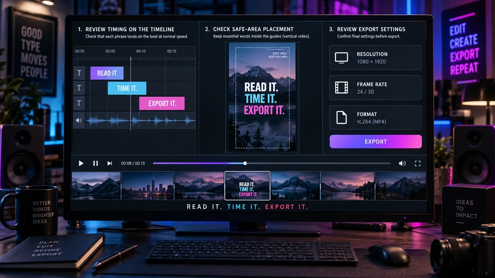
Run this review before the final export:
- Play from one shot before the text starts to one shot after it ends.
- Confirm that every phrase reaches a stable, readable state.
- Check spelling, line breaks and punctuation after duplicating layers.
- Mute the audio and confirm that the visual sequence still makes sense.
- Listen without watching and confirm that emphasized words match the intended rhythm.
- Inspect the first and last frame of every text layer for jumps.
- Check frame edges and platform overlay zones.
- Pause on the smallest and fastest text.
- Export a short representative section before a long project.
- Review the exported file at normal speed on the intended device.
CapCut's official animated text page lists resolution, frame rate and format among the export choices. Those settings protect the overall delivery, but they cannot fix a title that is too small, moves too quickly or sits under a platform overlay.
Fix common CapCut text animation problems
The animation applies to the whole text layer
A preset normally treats the selected layer as one object. If individual words need different timing, split the phrase into separate text layers and animate those layers independently. This gives control but requires consistent positioning and styling.
The typing effect reveals the wrong amount of text
Check whether the selected preset is built for a whole layer, a line or individual characters in your current build. If the result does not match the phrase, try a different preset or construct the sequence with separate word layers. Do not assume every typing thumbnail uses the same reveal logic.
The text jumps when the exit begins
The first exit state does not match the settled state. Add or move a keyframe so Position, Scale and Opacity are identical immediately before the departure.
The motion is smooth but the sentence is hard to read
Reduce simultaneous property changes. Keep the final text still longer, increase contrast against the background, and let fewer words move at once. A smooth animation can still fail as typography.
The text is visible in the editor but missing after export
Check the layer's duration, visibility, opacity and position at the export range. Confirm that the text has not moved outside the frame and that no higher layer covers it. If the problem affects static text as well, follow the dedicated guide for CapCut text not showing.
The motion starts too early or ends too late
Move the text layer to set its overall screen time. Move the animation keyframes or adjust preset duration to set motion time. Editing only one of these can leave the layer correctly placed while the movement remains out of sync.
The result looks different on another device
Mobile, desktop and web builds can expose different presets, controls and fonts. Preserve the intent rather than a preset name: entrance direction, landing position, duration and emphasis. If a preset is unavailable, rebuild that logic with Position, Scale and Opacity keyframes.
A practical CapCut text animation workflow
- Finish the wording before adding motion.
- Set font, size, color, contrast and final position.
- Decide whether the layer needs an entrance, exit, loop or manual path.
- Use one built-in preset when it solves the whole job.
- Switch to keyframes when timing or placement must be exact.
- Build a readable start and end state.
- Separate important words into their own layers only when independent timing helps.
- Match the strongest motion to the strongest word or beat.
- Leave stable reading time between entrance and exit.
- Duplicate a finished layer to preserve the style system.
- Check safe areas, contrast and line breaks at delivery size.
- Preview the full sequence at normal speed.
- Export a short section and review the actual file.
The CapCut tutorial hub can route you to timeline, text, captions and export guides when the surrounding edit needs work.
CapCut text animation FAQ
How do I animate text in CapCut?
Select the text layer, open Animation, and choose an In, Out or Loop preset. Adjust the animation duration, then preview the complete layer. Use Position, Scale and Opacity keyframes when a preset cannot deliver the required timing or placement.
What is the best text animation in CapCut?
The best choice is the simplest motion that supports the message. A fade works for quiet information, a short scale change emphasizes a result, and a directional move connects text to action in the frame. Judge readability after the animation lands.
How do I get a typing animation in CapCut?
Look for a typing or typewriter-style text animation in the current preset library. If it reveals the full layer differently from what you need, split the phrase into separate word layers and offset their timing.
Can I animate individual words in CapCut?
Yes. Put the words or phrase groups on separate text layers, keep their styling aligned, and animate each layer with its own preset or keyframes. This takes longer but provides independent timing.
Can I combine a preset with keyframes?
Yes, but use the combination deliberately. A preset can handle the entrance while Position or Scale keyframes create a later emphasis. Preview for conflicting movement and remove any duplicate motion that makes the text jump.
Why is my CapCut text animation too fast?
Increase the preset duration or move manual keyframes farther apart. Keep the text layer long enough to provide stable reading time after the entrance and before the exit.
Do text animations change after export?
The timing should follow the project, but font availability, platform differences and export settings can affect the result. Review a short exported section for line breaks, missing layers, stutter and safe-area placement before rendering a long project.
Final recommendation
Start with the final readable frame. The viewer must understand the words after the motion ends. Choose one entrance or exit preset when it performs that job cleanly; use keyframes when the route, rhythm or emphasis must be exact.
For kinetic typography, animate phrase groups according to meaning, keep supporting words quieter, and repeat the same motion rules across the sequence. The strongest result is not the one with the most effects. It is the one where motion makes the message easier to follow.