

To make text partly transparent in CapCut, select the text clip, open its text controls and lower Opacity. On Desktop, the path CapCut documents is Text > Basic > Blend > Opacity. Stop above zero if you still want to see the letters. A blended title, or video showing inside the letters, needs a different approach.
I'd decide which look you want before you touch the slider. A faint watermark, a title that reacts to the background and a hollow outline can all be called “transparent text,” but they're different designs.
Choose the result before choosing the control
| Result you want | What changes |
|---|---|
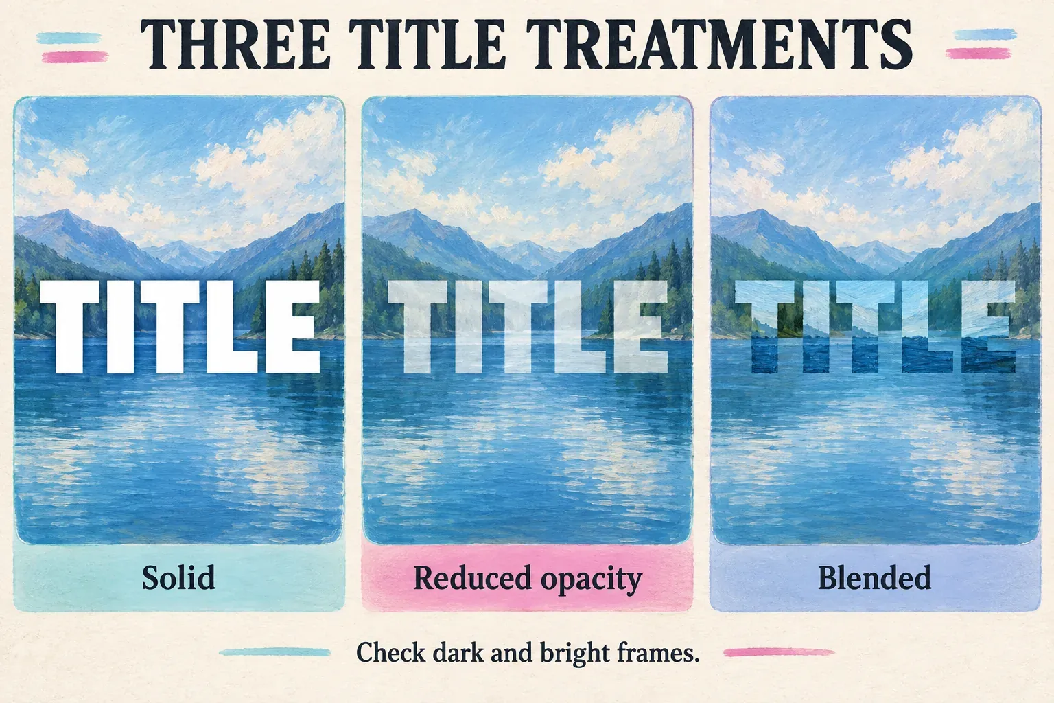
| A softer title or watermark over the same footage | Lower the text’s opacity. |
| Letters that interact with the light and color beneath them | Compare suitable blend modes where available. |
| An outline with clear interiors | Use an outline treatment with a separately transparent fill, or a prepared transparent PNG. |
| A title image with no rectangular background | Use an image with actual background transparency. |
| A different video visible only inside the letters | Use a letter-shaped mask or matte workflow; opacity alone does not create it. |
CapCut's transparent-text instructions cover adding ordinary text and adjusting its opacity. The title stays over the footage, and more of the picture underneath shows through. It doesn't turn the words into windows for a second video.
Keep the wording, font size and placement simple while you set up the effect. If you still need the basic layer, start with our guide to adding text in CapCut, which covers Mobile, Desktop and Web. This one picks up from there and deals with how that layer looks.
Lower text opacity on Desktop
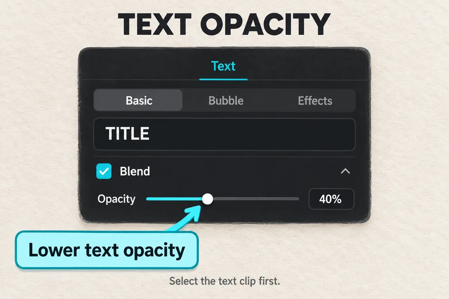
CapCut's text-opacity help has you select the text track, open Text > Basic and scroll to Opacity. In its reference panel, that slider sits inside the Blend section. Don't read too much into the name. A section called Blend can hold an opacity slider and still offer no list of blend modes.
- Put the playhead inside the text clip’s timeline interval.
- Select the text clip itself, rather than the video beneath it.
- Open Text, then Basic, and expand Blend if necessary.
- Lower Opacity until the footage shows through the letters without making the word hard to recognize.
- Play the full title interval, including any animation and changes in the background.
There's no single percentage that works everywhere. White lettering can stay visible over a dark scene at a setting that disappears against the next bright shot. Adjust while watching your real frames, then judge the result at the size your audience will see it.
Bring the value back up first if the title suddenly vanishes, before you swap fonts or rebuild the layer. Then check the playhead and the animation. A fully transparent title can still show a selection box in the editor, but that box isn't part of the finished video.
Find the text control on Mobile or Web
Go by the property more than its spot on the toolbar. CapCut's platform-specific text guidance puts Desktop adjustments in Basic or Style, and Web color or opacity in the selected text's editing panel. On Mobile, you start by selecting the text clip and opening Style, though labels and the controls you see can differ.
On a phone, tap the existing text segment on the timeline and open its editing or Style controls. Look for Opacity, scrolling through the selected text's options if you need to, and lower it if your build shows it. Don't change the video or overlay opacity and expect only the title to fade.
On Web, click the title on the canvas or timeline and check its text panel. Adjust the text's opacity, then play through the whole interval. If the panel doesn't respond, save the project before you refresh.
When the slider is missing, confirm you've selected ordinary editable text. A template, compound clip, caption block or imported image can expose different controls. Try one plain text layer on a copy of the project to see whether the setting belongs to that layer type. If you still can't reach the text control you need, finish the effect on Desktop or import a prepared transparent title image.
Hold on to the original project and source media before you switch platforms or group layers. A duplicate project helps with editing decisions, but it doesn't replace the independent copy our project-safety guide describes.
Use blend modes for a title that reacts to the footage
Opacity reduces how strongly the upper layer covers the picture. A blend mode works differently: it changes how that layer's colors combine with the layer beneath. Adobe's blend-mode descriptions spell out the distinction. Overlay combines darkening and lightening behavior, while Soft Light gives a softer light-and-dark interaction. Those definitions explain the visual logic. They don't tell you which controls every CapCut build exposes.
When a Desktop title needs those video-style controls, work on a duplicate and keep the footage underneath out of the title's group. CapCut's compound-text workflow covers it: run Create compound clip on the text, then make your opacity or blend adjustments.
- Finish the words and use a broad, readable font. Keep a copy of the editable text before grouping it.
- Select the intended text clip, right-click and choose Create compound clip if available. Include only the title elements you want to treat together, leaving the background video separate.
- Select that title compound. Inspect the Video controls for its Blend or blending-mode options.
- If Overlay or Soft Light is offered, compare it with Normal on the same frame. Then adjust opacity only if the effect needs to be weaker.
- Play across both dark and bright parts of the shot. Keep the mode only if the letters remain useful throughout.
Menu paths and modes can change. If the compound doesn't show the option, stick with the supported opacity slider instead of blindly following a tutorial's menu labels. Compounding puts the title in a different editing container. It doesn't guarantee a particular effect, and it won't make paid assets free.
An older CapCut discussion about contrast text proposes several different treatments, image overlays among them. That helps explain why two “transparent text” tutorials can aim at different looks. Those replies don't confirm today's interface, and they can't guarantee that a named mode is available on your phone.
Keep clear letter interiors separate from background transparency
Setting opacity to zero removes whatever part of the title that slider controls. Check any stroke, shadow or background on its own, because zero opacity isn't a dependable shortcut to a clean hollow outline. Hollow text needs a transparent letter fill and a stroke that stays visible.
Some text styles expose separate fill and stroke controls. With one of those, set the fill on its own and check the outline. Without them, build the outlined title as a PNG with transparent interiors and a transparent canvas around it, then import it as an image above the video. Keep the editable source, since the imported letters are pixels, not a CapCut text field.
Don't carry Photoshop's Fill instruction over to a CapCut opacity slider. Adobe's opacity and fill documentation separates Fill, which can leave layer effects visible, from overall Opacity. That explains the Photoshop route. It doesn't prove your CapCut text layer has an equivalent Fill setting.
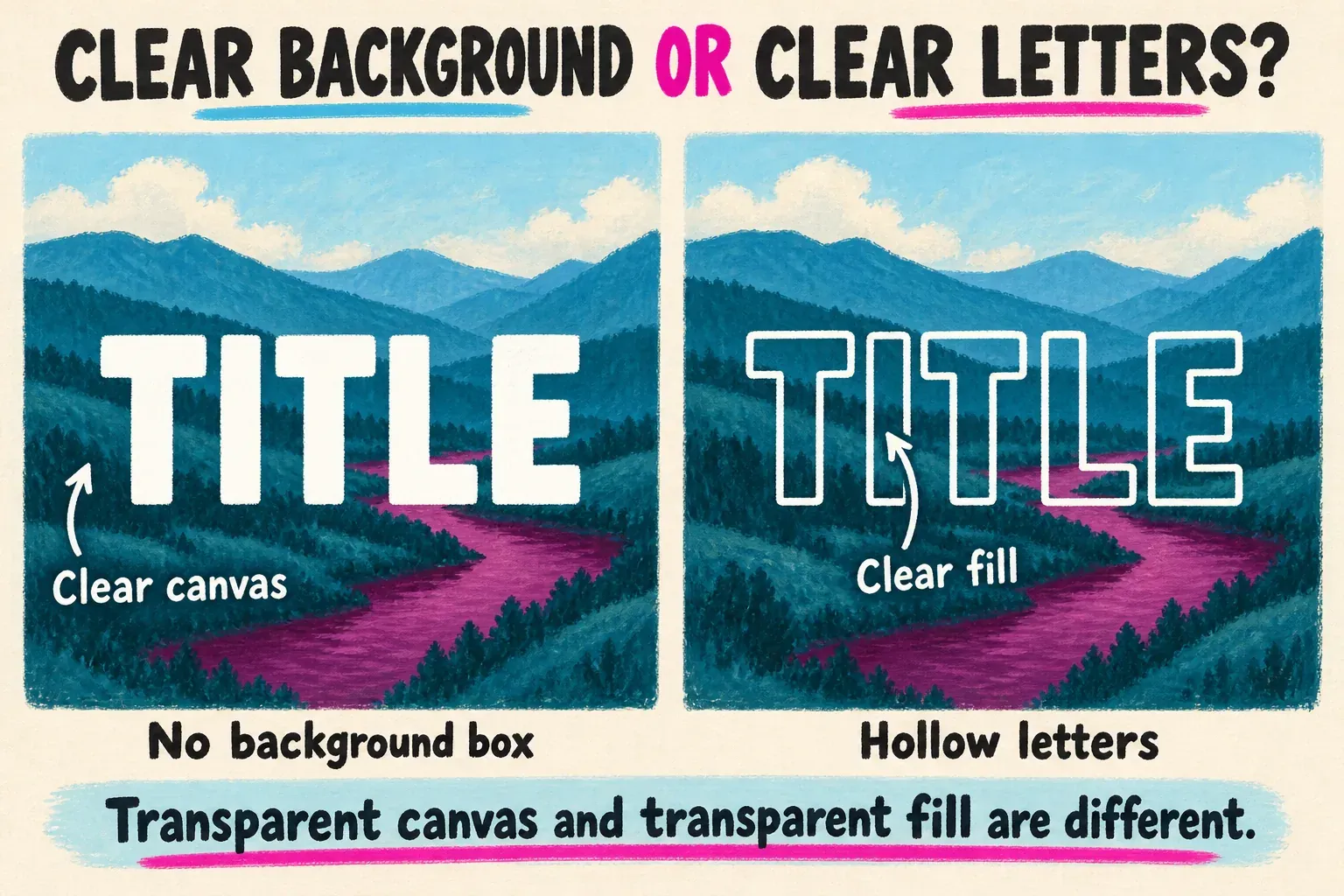
When an imported title covers the footage with a white, black or checkerboard rectangle, look at the source image. A picture of a checkerboard is still a picture. Lowering the whole image's opacity fades the rectangle and the letters together. It won't remove just the background. Use an asset exported with real transparency.
To show a different moving clip inside the words, you need a letter-shaped mask or matte to restrict that clip. That's a compositing job, and a text-opacity setting won't do it. In the same way, putting text behind a person relies on a foreground cutout above the words, while a transparent-video export is about the output file's alpha channel. You don't need either one for a partly transparent title over ordinary footage.
Check that the effect survives motion and export
Read the title at phone size while the scene plays. Look especially at a bright sky, dark clothing, fast movement or a cut beneath the word. If the title stops being legible, increase opacity, reposition it or use a quieter background. For speech captions and essential instructions, I’d keep solid, high-contrast lettering and use transparency in the decorative title instead.
Check the first and last frames too. A fade animation changes visibility over time, so an already faint title can almost disappear at the start and end. If you want a timed fade instead of a constant transparent look, use the text-animation guide.
Export a short, representative section and watch the saved file outside the editor. Make sure the right title appears, the background is intact and any imported image has clean edges. Then review the full export. If even a plain, clearly opaque title is missing, that's a different problem, so follow the text-not-showing guide.
Keep the editable project after you export. An ordinary finished video can show transparent-looking text over its footage, but it doesn't keep that title as a separate editable layer. For the next steps with text, layers and export, see the CapCut tutorial hub.